Case Study / Printing, Typography
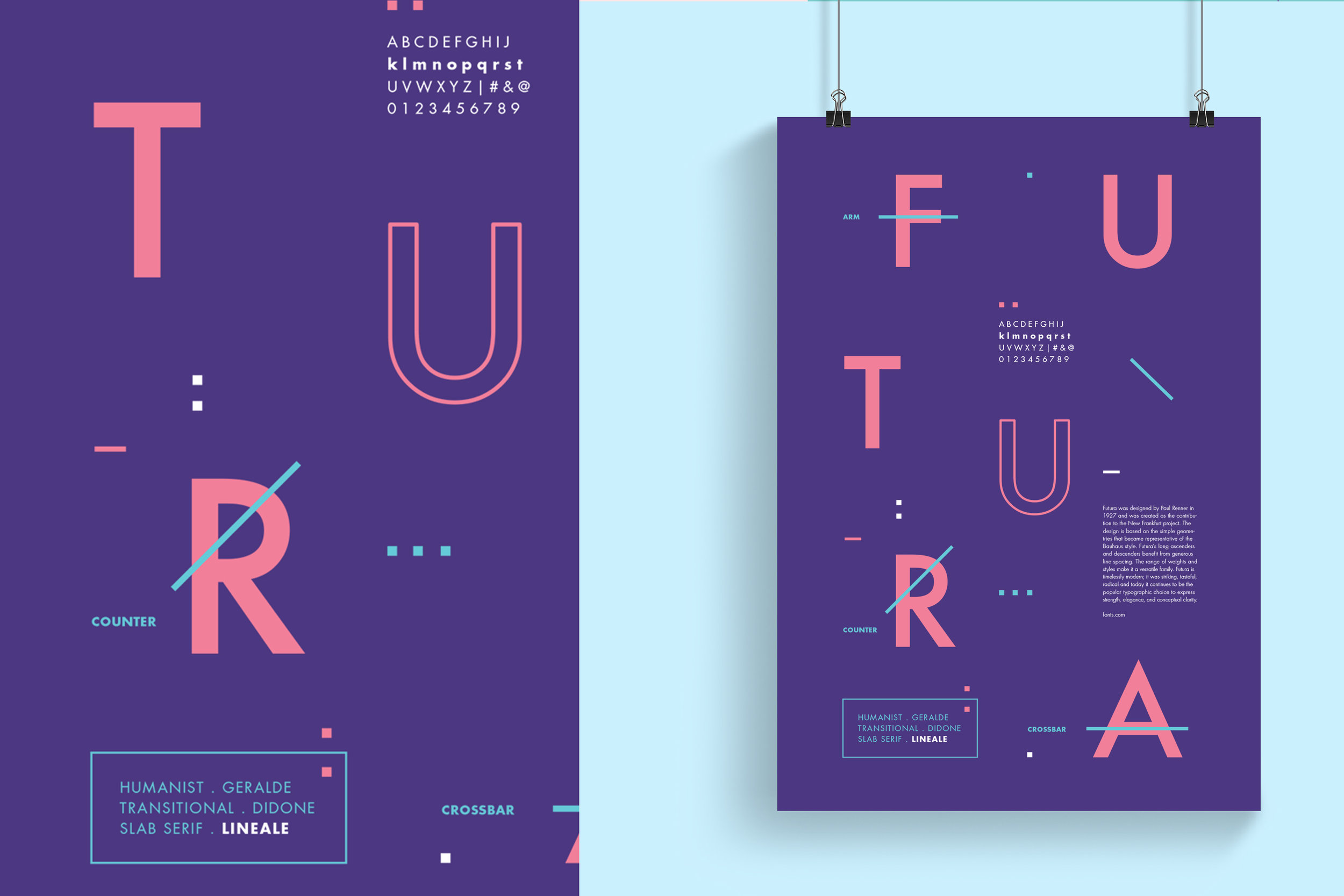
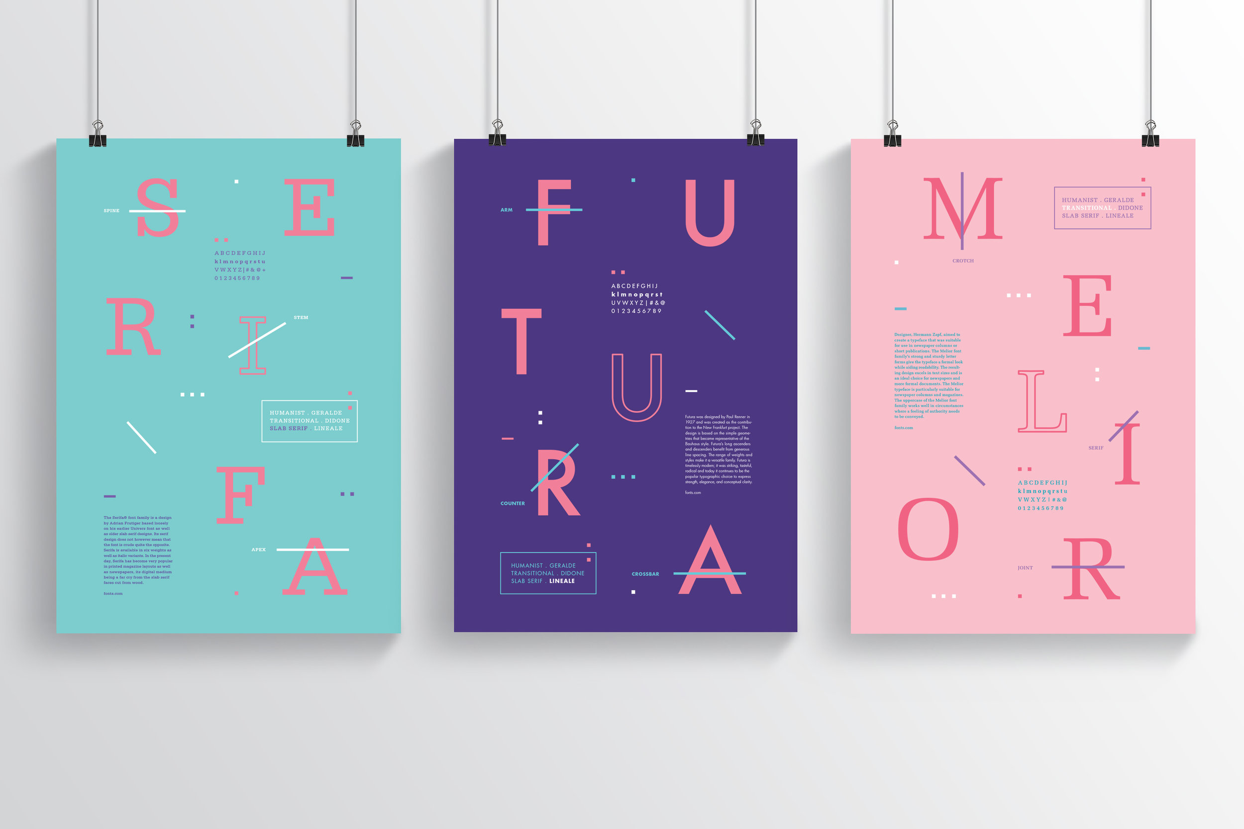
The objective of “The Series” is to design type classification posters with information on the typeface history and anatomy. Each poster should use the same visual system, and each one must come from a different typeface family (slab serif, transitional, and linear).
When creating these posters, I wanted to use more serious typeface (Serifa, Futura, and Melior) but in a not so serious way. This was accomplished through a fun color scheme and layout.


